Posts tonen met het label Make-up. Alle posts tonen

vrijdag 1 februari 2013

Hola holographic

By Neslihan
It was Chalayan's fall collection (RTW 2012) that introduced me to this wonderful technique and since I've got a weakness for everything that glitters, it didn't quite take me long before I fell in love with this thing called 'holographic' or a print that rather resembles the back of your CD. Or a tacky mix of metallics. Call it what you want as long as it shines and shimmers. That's why I've created this collage, to boost your mood and mine. Enjoy. (Click on the image to make it bigger.)
1) Amazing DIY clutch. Get creative here.
2) Husseyin Chalayan's RTW F/W 2012 collection
3) Shopper found here
4) The XX - Coexist
5) Hugo Boss clutch
6) Stella McCartney Resort 2012 collection
7) American Apparel swimwear (detail close up)
8) Wasteland brogues (GOT TO HAVE THESE BABIES)
9) Husseyin Chalayan's RTW F/W 2012 collection (detail)
10) 90's platforms, I'm in awe!
11) More is More (source unknown)

zaterdag 8 september 2012

Good Taste/Bad Taste

By Neslihan
Every season there are some remarkable trends/clothing pieces. Pieces that make you think: ew no, I will never wear this. You have to get used to the ugliness and/or oddity of those pieces. Once your eyes get used to it, you fall in love though. And only you get this love, you cannot explain. You cannot make others love it too. They won't understand. No one will but you don't care because the joy those pieces bring is worth every strange look you're given in the streets. It becomes your favourite piece and you wear it, you cherish it. You live it until the next season brings something else. It's time to let go. Some of us do and think: what was I thinking? Others don't and that item becomes a part of thier lives. It becomes a historical item. Something to pass on to the next generation.


Baggy luxurious sweaters
Absolute talk of the town are 
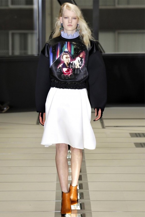
Balenciaga's excentric yet very cool sweaters. They have those strange 80's pictures and crazy laserish effects on them. Purple, pink, red: you name it, Balenciaga has it. Those chic sweaters were also spotted on Hakaan's runway but he went for a chilly metallic version. The sleeves were equally puffy. (Both fall/winter 2012 RTW)

Metallic patchwork
A little shimmer a day keeps the doctor away. I think sparkles, glitters, metallics certainly light up your outfit and even your mood. I like how a little bit of the previous can give your outfit this playful naiveté. As if you stepped right into your childhood again. And that was just what Huseyin Chalayan evoked in me. You cannot put Chalayan's dress as simply childish patchwork though because it's too sophisticated for that. Look at that finishing and the fit of the dress. See how he has used beige to keep the whole outfit in balance. It's kindergarten for grown-ups. The second dress is not from this season but it belongs to s/s 2013. This actually shows us that metallics are a keeper this year. Thank you, Hugo Boss.

Layering
While Marni kept it simple, A.F. Vandervorst went in overdrive. Marni was about taking 'colourblocking' to the next level. See how every piece totally 'stands' on its own and how it -at the same time- blends in with the other pieces. It's all about layers and neutral colours making the totality wearable. 'Wearable' is not a disgusting word. Repeat after me: WEAR-ABLE. Good girl/boy. We saw something else on the A.F. Vandervorst runway though. The Belgian couple played hide and seek with us and were inspired by Joseph Beuys. Google this man and you'll get the hats. Fashion was never this anonymous. (Both fall/winter 2013 RTW)


Living sculptures

You can interpret this one as wide as you want. Maison Martin Margiela never disappoints me, that's one thing I can say. When haute couture was about the amazing diamond masks, ready to wear is a little less freaky. You'd almost say 'civilian' if you didn't look past the three first looks because those skirts are divine, you've got to admit. Creating a new meaning for two previous trends (peplum and asymmetrical skirts) in only one show? I'd say genius. Look at that gorgeous fish tail/peplummed skirt. Look at the rich fabric and prints. See how this image clashes with the image underneath it (read 'Viktor and Rolf'). The Dutch duo based their collection on strong women. "Oh, how original." Stop right there. They went for femme fatales and actual female warriors (the red faces say it all). Look at the coat, it looks like it's made from shiny grey, handicraft paper. The gear wheels are murderous. (Both fall/winter 2013 RTW)

A lesson in history
Dries Van Noten had access to the archives of the Victoria and Albert Museum. He used Japanese and Chinese images and mixed them with his well-known abstract prints. This created new prints of course. And aren't amazing prints Van Notens trademark? While Dries focussed on the Eastern history, the Italian fashion duo, Dolce & Gabbana, chose the Sistine Chapel as inspiration. The embellishments combined all together were at times too much but the prints are definitely something to think about. (Both fall/winter 2013 RTW)
No go?

H&M 39.90 EUR

Marc Jacob's pelgrim shoes (fall/winter 2013 RTW)
Christopher Kane's flat sandals (spring/summer 2012 RTW)
Backstage at Chanel (fall/winter 2013)
Pictures: Vogue Paris

zaterdag 28 april 2012

Make up your mind


By Neslihan
Fashion is about extremes. You wake up and being a good girls is en vogue. You go to bed certainly noticing that bad is the new good. Fashion is constantly in motion and so is beauty. Lara Stone is being praised for her voluptuous body in 'Vogue Paris' while 'W' is screaming that Freja Beha Erichsen is the norm. Even fashion people do not agree on a certain level, which makes fashion a fickle industry. Fashion though is so much more than just an industry. It's a factory of handcrafted dreams. Note the contradiction. Yes, fashion is about mind blowing contradictions. That's also what I noticed when comparing the two pictures below. The first one is a shot from Anna Sui's f/w 2012-2013 show while the other one is from Givenchy's last s/s collection. Both have an incredible similarity: the make-up. The models have this cute little dot right under their lower lashes but they're both still very different. While Anna Sui's model looks like this amazing rock chick, Riccardo Tisci wanted his models to look like angels of the ocean. His models have this shiny, silver tear which makes the look  even more poetic. Which one do you prefere?


Pictures: Vogue.fr

dinsdag 21 februari 2012

Disastrous comeback and its disastrous consequences

I warn you for the amount of 'drama' that is on its way. Let's start with dissecting this title for instance. I have been off the blogosphere for quite some time right now. And I had my reasons. There were moments during which I just had a writer's block and there were also moments during which I had tons and tons of inspiration but I just didn't know how to write it down. And just when I had lots of ideas and topics to write about my computer crashed. And since I'm a little superstitious I thought this was a sign from above. The fashion gods just don't want me to write about 'la mode'. Now, I'm thinking: screw you! I'll write whenerver I want and what I want to write about! So here I am, making a 'comeback'. What a dreadful word. It just makes me nautious. I also have some surprises for you. I'm not going to reveal what these surprises are, you just have to follow this beacon of -let's hope- inspiration. Okey, I'll give you a hint: it involves this 'fashion friend' of mine. Curious? Stay tuned.

L'officiel Paris February 2012- Editorial/ Review
I couldn't help but post these pictures of this month's L'officiel Paris. It was a very special edition indeed. You'd almost think that it was L'officiel Afrique. What an amazing concept. On the cover Afro-American delight, Chanel Iman, starring in a fashion shoot with two other black beauties. The three models were posing in the prettiest outfits (spring/summer 2012) of huge brands like Dries van Noten, Prada and Chanel. There was also another fantastic photoshoot called 'Belleville-Bamako'. The model, Egle (never heard of her before), was white and that created an amazing contrast between the set, the colourful prints and the make-up, which was kept simple: red lips and a great skin. Tulbands, shades of brown and orange and African prints made this photoshoot super powerful. There was also a lot of hotness and sensuality in this edition and that was because of the 'Riviera Revival' photoshoot, which remembered the glorious times of the riviera during the 50's. That was a bit about this month's L'officiel Paris, if you still do not own this great piece of art: get your fat ass to your newsagent and buy it!
The cover


'Town chic' 


'Belleville-Bamako'

'Reviera Revival'

Love,Neslihan D.

woensdag 5 oktober 2011

Met de ogen dicht op je eigen huwelijk/Close your eyes on your wedding day

Sinds ik altijd op zoek ben naar inspiratie, geïnteresseerd ben in verschillende culturen en into weddings ben, was ik dan ook meteen geboeid door een mini-artikel in een oude Marie Claire (NL) over Torbeshi-bruiden. Nu hoor ik je al denken; Torbeshi-watte? Wel, de Torbesh is een kleine bevolkingsroep die zich tussen Macedonë en Kosovo bevindt. Ze hebben een aparte cultuur die heel wat Servische en Macedonische invloeden kent. De Torbeshi spreken in de eerste plaats Macedonisch, maar hebben ook een eigen taal die een mix is van het Servish, Macedonisch en zelfs een beetje Turks. Nu ben ik dus dankzij Marie Claire te weten gekomen dat ze ook aparte tradities hebben als het aankomt op het huwelijk. De bruiden worden prachtig gemaquilleerd, maar de make-upbehandeling lijkt in de verste verte niet op die van ons.Geen rode lipjes, smokey eyes of perzikkleurige wangetjes voor deze bevallige Torbeshi-bruidjes. Neen, zij gaan steevast voor een kalkwitte huid met blauwe prachtige versiersels op hun gezicht, indrukwekkende gezichtsbeschilderingen bestaande uit wondermooie bloemetjes, blauwe pailletten, fijne kralen (etc). De beschilderingen zijn tegen het slechte oog en ongeluk op de huwelijksdag. Het gevolg is natuurlijk dat de make-upsessie ongeveer drie uur duurt, maar het resultaat is niettemin verbluffend! Deze Slavische bruidjes lijken wel weggelopen uit een of ander sprookje. Er is eigenlijk ook wel iets negatiefs aan dit alles, aangezien de witte verf op basis van een soort kalk gemaakt wordt, weegt de verf enorm zwaar en kunnen de oogleden van de lieflijke bruidjes niet open blijven. Het gevolg is dus dat ze hun eigen huwelijksdag moeten missen. De bruiden weten gelukkig wel wie hun bruidegom is, want ze kozen hun bruidegom gelukkig zelf voor het huwelijk...

English translation: Since I'm always in search for inspiration, love exploring new cultures and am into weddings, I found it super interesting to read about Torbeshi brides in an old Marie Claire (NL). I am not expecting you to be know what Torbeshi brides are because nor did I. Lucky for us google exists. My dear friend, google, told me that the Torbesh are a small population that live between Macedonia and Kosovo. They have a unique culture that has a lot of Macedonian and Serbian influences. The Torbesh speak primarily Macedonian but they also have their proper language which is a mix of Serbian, Macedonian and even a little Turkish. Thanks to Marie Claire I discovered that these people also have their own traditions when it comes to weddings. The brides get beautiful make-up for their special day but their makeover doesn't look like the wedding makeovers we have over here. No red lips, smokey eyes or peach cheeks for these lovely brides. No, they go for a chalk white face with delicate blue ornaments, impressive facial ornaments consisting of wonderful, little flowers, blue sequins, small pearls (etc.). The facial paintings are used against evil eyes and bad luck on the big day. The result is actually that these make-up sessions almost take three hours but the effect after is breathtakingly beautiful. These Slavic brides seem to have run away out of some fairytale. There's also something negative about this lovely makeover: the white paint they use for the bride's face is made of some sort of chalk and it weighs so heavy that the bride isn't able to keep her eyelids up. So the consequence of this all is actually the fact that the bride is missing the whole wedding. Her own wedding! Luckily for her she already knows who she's marrying since she has chosen her groom before she decided to mary him...
Bron/source: Marie Claire Nederland/Netherlands september/September 2010

Geschreven op 08/07/2011/ written on the 8th of July 2011.
N.D.